Forza Auto Body
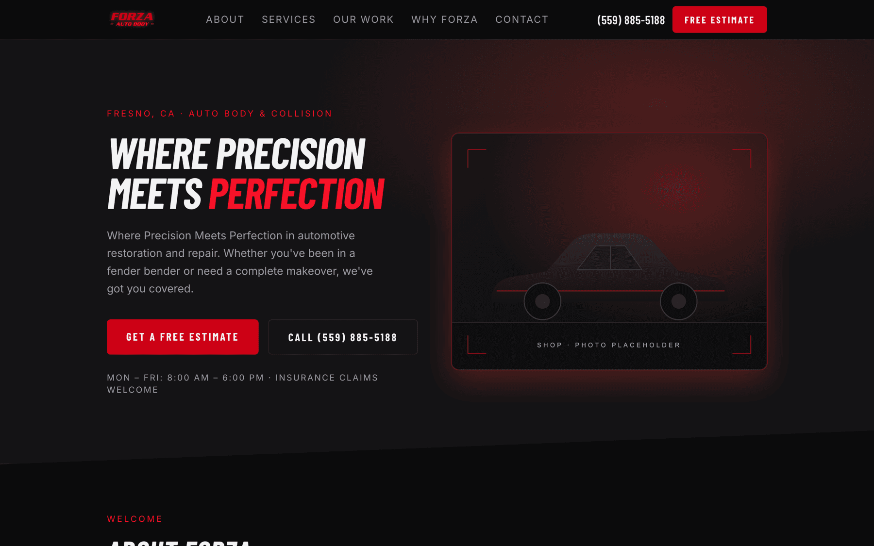
A one-page rebuild of an ageing WordPress site for a Fresno collision repair shop. The interesting part is the red: the theme declared one value, the logo used another, and the difference is why every button on the first draft looked orange next to the shop's own wordmark.
Complete and deployable. forzaautobody.com still serves the old WordPress site; going live is a DNS change the shop has to authorise.
- Role
- Brand and colour analysis · Art direction and design system · Frontend development · Content audit and rewrite
- Year
- 2026
- Industry
- Automotive · Collision repair
- Technologies
- Next.js 15 · React 19 · TypeScript · Tailwind CSS v4 · GitHub Contents API · Vercel Blob · JSON-LD
The challenge
Replace a slow WordPress site without losing the brand the shop already had — the wordmark is recognised locally and predates the site.
The published copy could not simply be lifted. Two service descriptions repeated other sections word for word, there were typos in the shop's own headings, the social links pointed at empty profiles and the Yelp link pointed at an unrelated business.
Nothing about price, warranty or turnaround has ever been published by the shop, so nothing about them could appear on a new site either.
The approach
The brand colour was recovered rather than copied. The WordPress theme declares its red as #ed1c24, and building the first draft on that value made every button and heading read orange sitting next to the shop's own logo. Decoding the logo PNG and counting fully opaque pixels explained why: #ed1c24 is the thin outline around the letters — about 14% of them — while the letterform fill is #cd0015, a deeper crimson, at 76%. The fill is the red the eye actually registers as “Forza”.
That produced a three-step ramp on a single hue at 354°, so the reds read as one colour at three brightnesses rather than three colours: the exact logo fill for surfaces, a brightened version for red text on near-black (3.4:1 is unreadable, 4.7:1 is not), and a deeper one for pressed states. White on the logo fill measures 5.8:1 — better than the theme's own red would have given.
The wordmark leans, so the headings lean with it: Barlow Condensed italic, the closest freely available face to the heavy condensed slant of the logo.
Content was corrected rather than reproduced, and every correction is flagged in the handover for the shop to confirm.
The process
- 01
Read the logo, not the stylesheet
The wordmark PNG was decoded and its opaque pixels counted by colour. The result overruled the theme variable — an inherited CSS value is a claim about the brand, not evidence of it.
- 02
Audit the copy
Every published line was compared against every other. Duplicated blocks, typos and dead links were listed before a single component was written.
- 03
Build the page
Six sections, each its own component, all reading from one typed content file.
- 04
Prove the contrast
Every colour pairing that carries text was measured, and the ones that failed were replaced rather than approved.
The solution
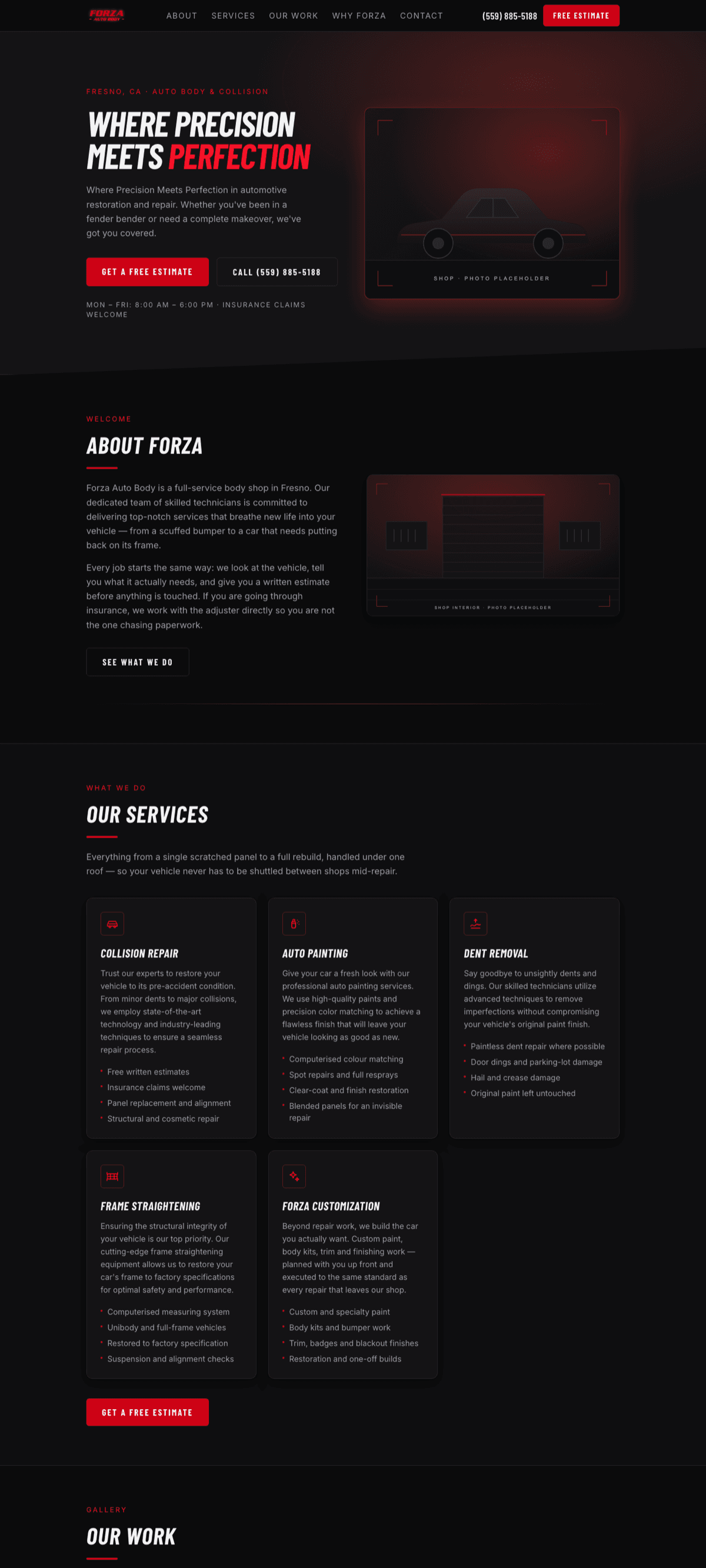
A one-page site — hero, about, services, work gallery, reasons to choose the shop, and contact — that keeps the shop's own voice and its own red.
An estimate form that composes a fully populated email from the visitor's own mail client, so there is no backend to secure, rate-limit or pay for.
The same git-backed editing panel used across these builds, so the shop can change hours, services and photos without a developer.
The design system
The tokens this site is written in. Every colour below is a value from its stylesheet, not an impression of it.
- Ink#0b0b0cPage
- Carbon#141416Cards
- Forza#cd0015Fills — logo fill
- Forza soft#f51228Red text on dark
- Forza deep#a30011Pressed
- Barlow Condensed ItalicDisplay — matches the wordmark slant
- InterBody
Technical perspective
The decisions worth defending. Written to be readable by someone who will never open the repository.
Contrast measured, not eyeballed
Fill and text colours were split because they have different jobs. The logo fill stays exact wherever it is a surface; red text on near-black uses the brightened step. Every pairing on the page clears AA, including the one the theme would have shipped at 3.4:1.
Shop details are validated because search reads them
Phone, address, map link and hours feed the AutoBodyShop structured data. The panel rejects a phone number with fewer than ten digits, an empty address or a non-https map link on save — a local search result is not a good place to discover a typo.
No backend for the estimate form
A mailto: composed from the filled fields. Name plus either a phone number or an email is the minimum; everything else is optional. If the shop later wants submissions as records, that is the one piece that needs a server, and nothing else on the site changes.
Placeholders that cannot be mistaken for photographs
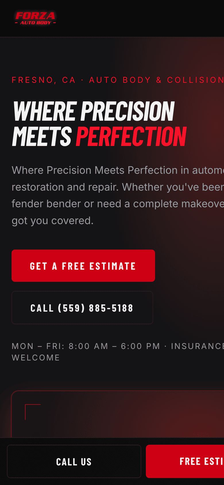
The shipped artwork is abstract SVG, each frame captioned PLACEHOLDER. They render unoptimized, deliberately, rather than turning on a global flag that allows SVG through the image optimizer for artwork that is about to be replaced.
A cutover that keeps the mail running
Going live means repointing A and CNAME records at Vercel while leaving nameservers with the registrar, so the shop's MX records — and its published email address — keep working through the switch.
Outcome
- Of logo pixels are the real brand red
- 76%
- Contrast of white on that red
- 5.8:1
- Content errors found and flagged
- 4
Built, documented and ready. The shop's live domain still runs WordPress; the cutover is theirs to schedule. No price, warranty or turnaround figure appears anywhere on the new site that the shop has not published itself.
What it still needs
Every project here ships with the list of what is still missing. Hiding placeholders would make the rest of this page harder to believe.
- The shop's approval on two rewritten service descriptions.
- Real photography of the shop and completed work.
- Working social profile URLs — the published ones are empty or point elsewhere.
- A scheduled DNS cutover from the current WordPress host.