РемСервис
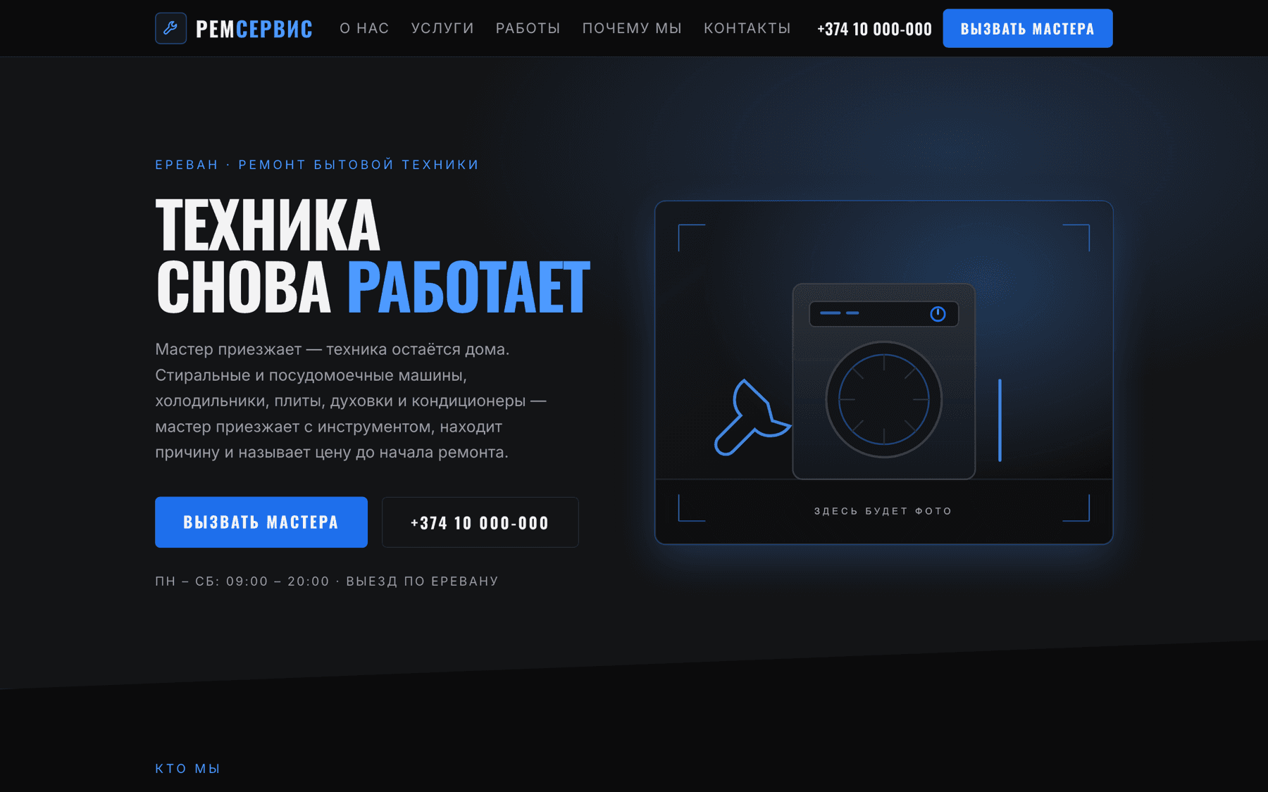
A one-page site for an appliance repair service in Yerevan. Russian-language and mobile-first, because the visitor is usually standing next to a broken washing machine holding a phone. Both the colour and the typeface were chosen for reasons that survive being questioned.
Built and complete, but every contact detail is an openly fake stand-in and there is no repository behind the editing panel yet.
- Role
- Art direction and design system · Frontend development · Content model and editing panel · Reusable component work
- Year
- 2026
- Industry
- Home services · Appliance repair
- Technologies
- Next.js 15 · React 19 · TypeScript · Tailwind CSS v4 · next/og · GitHub Contents API · Vercel Blob
The challenge
The audience arrives mid-problem, on a phone, wanting to know two things: do you fix this, and how fast can you get here.
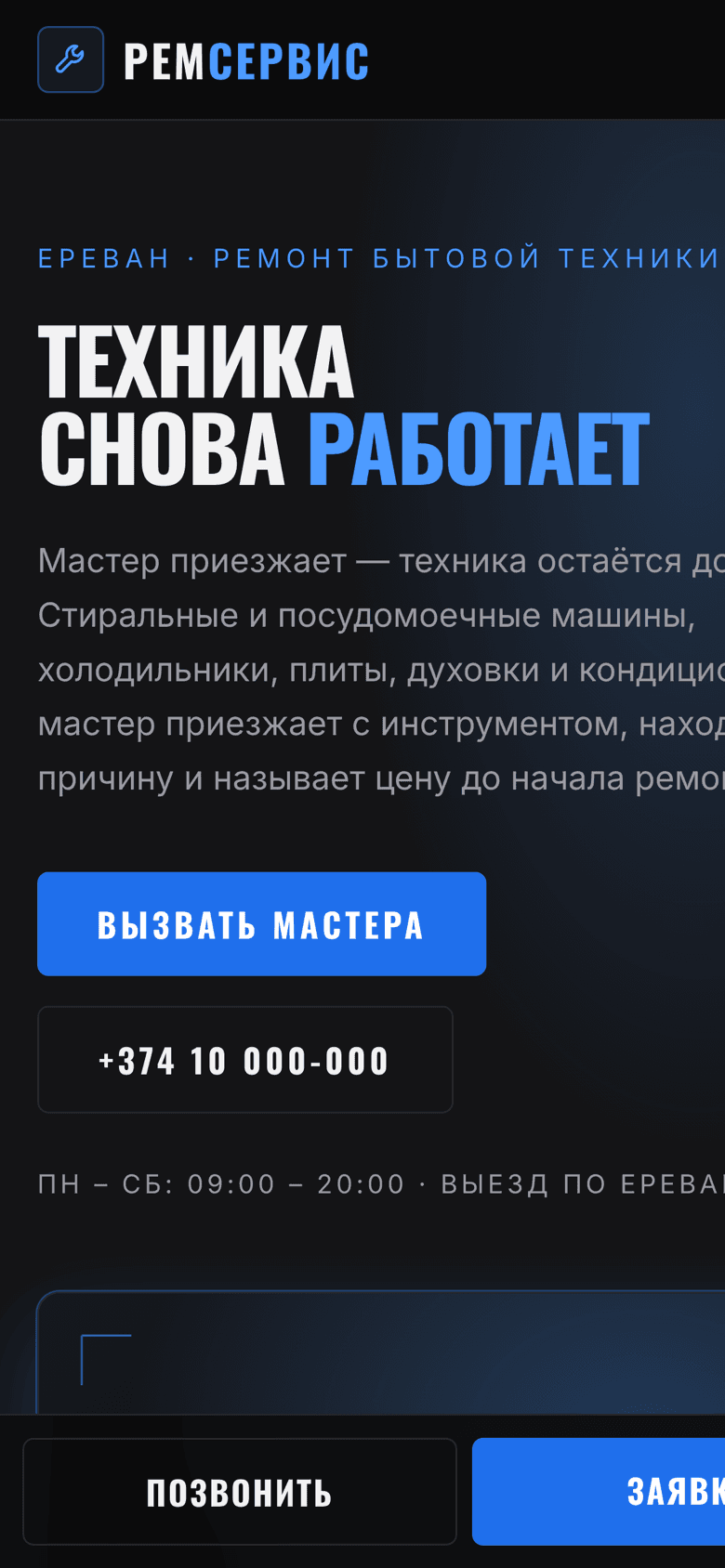
Russian sets differently from English. Compound words like «посудомоечная» and «водонагреватель» break a normal grotesque across two lines at heading sizes and shred the layout.
The service had supplied no verified contacts, so the site had to be built to be honest about that rather than filled with convincing-looking fakes.
The approach
Blue, but not as a default corporate choice — it is the colour of indicator lamps and wiring, which is what makes it read as “appliances and electrics” rather than as a clinic or a car service.
Three blues on one hue ramp at roughly 216°, split by job: a fill that carries white text at 4.6:1, a lifted version for blue text on near-black where the fill would only manage 3.1:1, and a deeper one for pressed states.
Oswald for headings, chosen for metrics rather than mood. It is one of very few condensed Google faces with a Cyrillic set, and condensed is what keeps those long Russian nouns on a single line. It has no italic, so unlike the Forza build there is no slant anywhere.
Every unverified detail is written as an obvious placeholder — a phone number of all zeros, an unregistered domain — so nothing can be mistaken for real information.
The process
- 01
Set the words first
The longest service names were typeset at heading size before any layout existed. The typeface was chosen from what survived that test.
- 02
Scope by licence
Gas equipment was left out of the service list deliberately: working on a gas main requires a licence, and the service has not said it holds one.
- 03
Build the page
Six sections, all copy in one typed JSON file, the same content architecture as the other one-page builds.
- 04
Extract the signature
The sign-off block used across these sites was generalised here into a portable, dependency-free component with eight presentation variants.
The solution
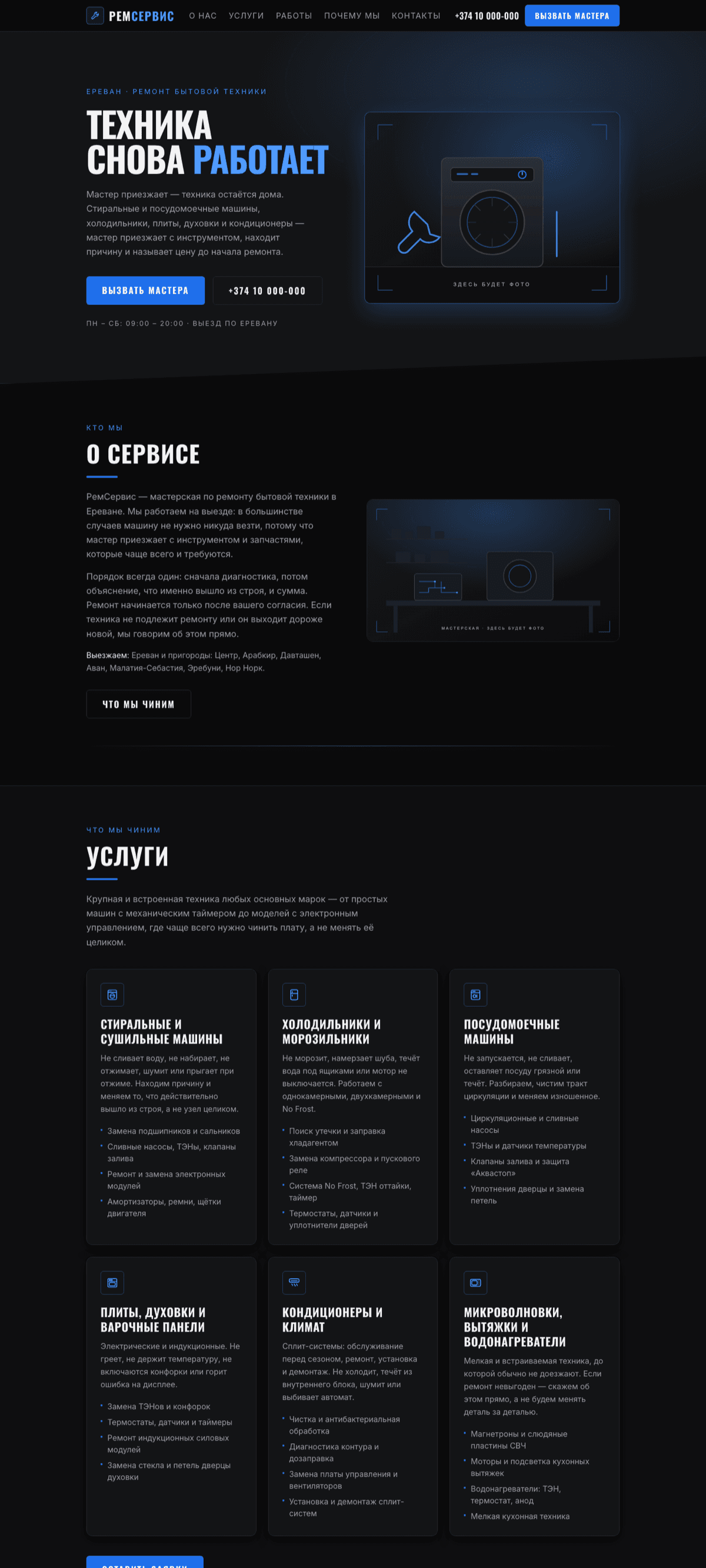
A one-page site: hero, services, about, work gallery, how the visit works, and a request form.
The same git-backed panel, so the service can edit contacts, service areas, hours, photos and every list on the page.
A social preview card that renders correctly in Cyrillic — which took a deliberate fix.
The design system
The tokens this site is written in. Every colour below is a value from its stylesheet, not an impression of it.
- Ink#0b0b0cPage
- Carbon#141416Cards
- Volt#1f6febFills
- Volt soft#4c9affBlue text on dark
- Volt deep#1552b8Pressed
- OswaldDisplay — condensed, with Cyrillic
- InterBody
Technical perspective
The decisions worth defending. Written to be readable by someone who will never open the repository.
The Open Graph card needed its own font file
Facebook, WhatsApp, LinkedIn and Slack will not display an SVG as a preview image, so the card is rendered as a 1200×630 PNG at build time. The renderer has no built-in Cyrillic face: without an Oswald TTF passed to it explicitly, every Russian word on the card would render as empty boxes. The font files are read at build and never at runtime.
Contacts are validated because search reads them
Phone, address, service areas and map link feed HomeAndConstructionBusiness structured data. The panel rejects a number shorter than eight digits, an empty address, empty service areas or a non-https map link.
A signature that cannot silently lose its colours
The creator sign-off is a self-contained folder with prefixed CSS instead of utility classes, because every site in this run uses different colour tokens. Utility-class markup copied into a neighbouring project loses its colours without erroring — the classes simply do not exist. Deriving from currentColor instead means the block inherits the text colour wherever it is placed, which also solves light and dark themes without a single line about themes.
Keyboard and reduced motion in a component nobody audits
Everything that expands is reachable by Tab, marked with aria-expanded, closes on Escape and on an outside click, and drops its transitions to 1 ms under reduced motion. Four of the eight variants use no JavaScript at all — CSS and a native details element.
Outcome
- Sign-off variants, zero dependencies
- 8
- Contrast of blue text on the page
- 6.9:1
- Real contacts published as real
- 0
Built and complete as a site. It is not live: the phone number, address, email and domain in the content file are stand-ins, chosen to be visibly fake, and the repository the editing panel points at does not exist yet.
What it still needs
Every project here ships with the list of what is still missing. Hiding placeholders would make the rest of this page harder to believe.
- Real contacts: phone, address, email and a registered domain.
- A GitHub repository, so the editing panel has something to read and commit to.
- Real photography of the workshop and completed repairs.
- WhatsApp or Telegram numbers, which suit a call-out service better than email.